
RESEARCH
A "Ruff"
Start
To kick off the redesign, our team wanted to understand how Luna Siberian Husky Rescue currently engages their target users to adopt and learn more about the rescue. We initially contacted the owner and learned that the nonprofit is privately run by a woman named Shanne. Due to her busy schedule, we were not able to question further any information regarding the usability of her website.
Since we needed more information regarding usability and function, our team began redlining the current website focusing on identifying services she is trying to provide to the public and if users can easily navigate through different amounts of information.


Enough information? Not quite.
Let's dig a little deeper.
Keep
Digging
Initially, our team developed a rough idea of or ideal user to jumpstart our research questions. We wanted to learn what users look for when navigating through the current rescue website. By doing so, we did a quick usability test focusing on a simple task for users and a couple of informational questions as they navigate the rescue site.
User Task
You are interested in adopting a husky and found this local rescue, please go ahead and walk me through what you would look for on this site to follow through with the task of adopting.
Additional Questions
1. How much does this rescue charge for adoption fees?
2. Based on this application, would you go through with submitting it?
Why or why not?
3. What info do you wish to see on this website?
4. What do you want to know before committing to adopting a dog?
5. Freely navigate and provide feedback
From these tests we discovered high-level detailed insights. Overall the website had a basic navigation, several broken/unfinished pages, and not enough imagery. We found that there were a significant number of issues regarding broken links and informational pages that lacked hierarchy. Users complained of uninteresting and
non-engaging content.

To gather even more information, we conducted surveys addressing 3 main topics:
- User’s background with dog care and adoption
- User’s previous or current dog adoption process
- What would incline a user to adopt a dog
For a more one-on-one approach with our users, we held 4 user interviews. Similar to the survey, we addressed those same topics through open-ended questions relating to the topic.
What We
Uncovered
Our grand total of 32 survey responses and 4 user interviews showed that most of our users had backgrounds in basic animal care and prior adopting experience. They also expressed wanting more specific information about huskies when looking to adopt. Most of them also preferred higher quality imagery with an inviting website aesthetic.
After collecting our data, we searched for similar behavioral patterns and themes that zone in on our target users’ goals, pains, and gains, arranged into our diagram. We realized that their pain points mostly stem from functional physical constraints.
However, the key insights revolve around risks of becoming discouraged by boring reading sections, lengthy forms, and tiresome application processes, which are points we can cater to as UX designers.
With all the data collected, our team developed our ideal user persona, Kristy Franklin. This user helped drive design decisions throughout the rest of the design process.

DEFINITION & SYNTHESIS
Pack
Leader
In order to narrow down our focus, we brainstormed different product features and ideas based on the research previously done. We asked questions such as, “What can we currently execute now for users?” or “How about in the far future?” We prioritized certain features over others to help sort out the impossible from the possible.

The matrix revealed that we wanted to focus on the clarity and simplicity of quizzing users to see whether or not they’re ready to adopt a husky into their family. We highlighted simple features of more importance, such as call to actions leading users to the opportunity to learn more about husky care.
Now for the overall redesign.
Starting with the navigation.
Lay Of
The Land
Almost every page on the current website looked the same. The main navigation bar had only 9 primary pages and the “Learn” tab was the only page with enough information to scroll through. Many links were broken and overall usability was insufficient for visitors that landed on the website.

Our Solutions
- Consolidate the 9 pages to 5 (Home, Learn, Adopt, Foster, Donate)
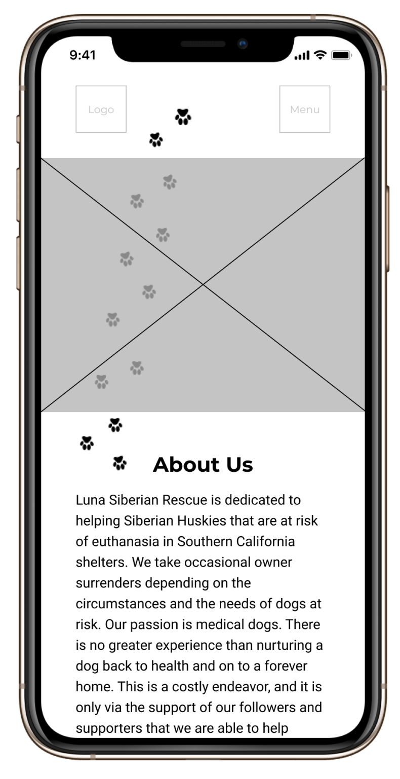
- Open the homepage with a hero image of a husky with nonprofit’s mission statement
- Add information about the organization along with ways to adopt and learn more
The solutions we chose helped condense the navigation for a clearer picture of who the organization is and the services they provide.

User
Flow
Starting at our homepage, our potential user would find their way to the “Learn” tab by scrolling to the CTA or using the navigation bar. Here, users have the option to interact with the quiz.
If they succeed they can view the adoptable dogs, or if they do not pass, they can request a consultation with the founder of the organization for further information.
The purpose of this is to help users decide if they are ready to
adopt, or require more knowledge about the breed before taking on pet responsibilities.

PROTOTYPING & TESTING
Starting
From
Scratch
We began the next phase by creating a simple mockup to test for initial feedback of our ideas. Our team chose a mobile first approach in order to prioritize the most important features as the foundation before moving onto the web version.
Objective
Research Questions
- Can users scroll through the adoptable dogs carousel?
- Can the user pass the learning quiz without dead ends?
- Can they interact with the FAQ cards?
After testing the app, our testers made it apparent that some features needed improvement. The homepage needed a functioning, flippable card for users to interact with and there was too much information to scroll through. On the Learn page some important content regarding the FAQ questions weren’t visible and the paw design elements were getting distracting. Finally, regarding the quiz, users wanted to see both right and wrong answers with an explanation of the correct answer.
Our Solutions
Microinteractions and other design elements were added to avoid cognitive overload and enhance user interactions/feedback. The paw prints were also strategically moved around to limit distractions. We also started implementing a new style guide inspired by snow terrain and hues of blues and grey similar to the coat of a Siberian Husky instead of keeping the simple purple color scheme on the original website.


Forging
Ahead
The latest redesign of Luna Siberian Husky Rescue focuses on promoting the ease of navigation through the website without overwhelming users with too much information and encourages users to learn more about adopting and fostering through educational modals and interactive elements.


